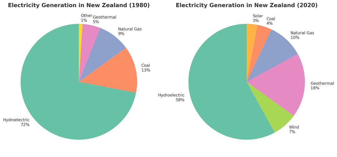
The pie charts below show the percentage breakdown of electricity generation by energy source in New Zealand for the years 1980 and 2020.
Summarise the information by selecting and reporting the main features, and make comparisons where relevant.
Write to See your Score
Words: 0
No submissions yet