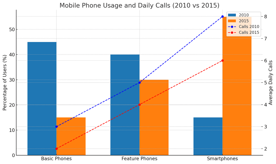
The charts below show the percentage of people who used different types of mobile phones in 2010 and 2015, and the average number of calls made on different types of mobile phones per day in 2010 and 2015.
Summarise the information by selecting and reporting the main features, and make comparisons where relevant.
Write to See your Score
Words: 0
No submissions yet